One Strong Arm
(letterpress, branding, research, social media)
I did an internship at One Strong Arm, a design and letterpress print studio in Dublin, where I assisted on various projects including layouts for menus, annual reports, booklets, magazines, branding, and social media.
![]()
Scoop Foundation
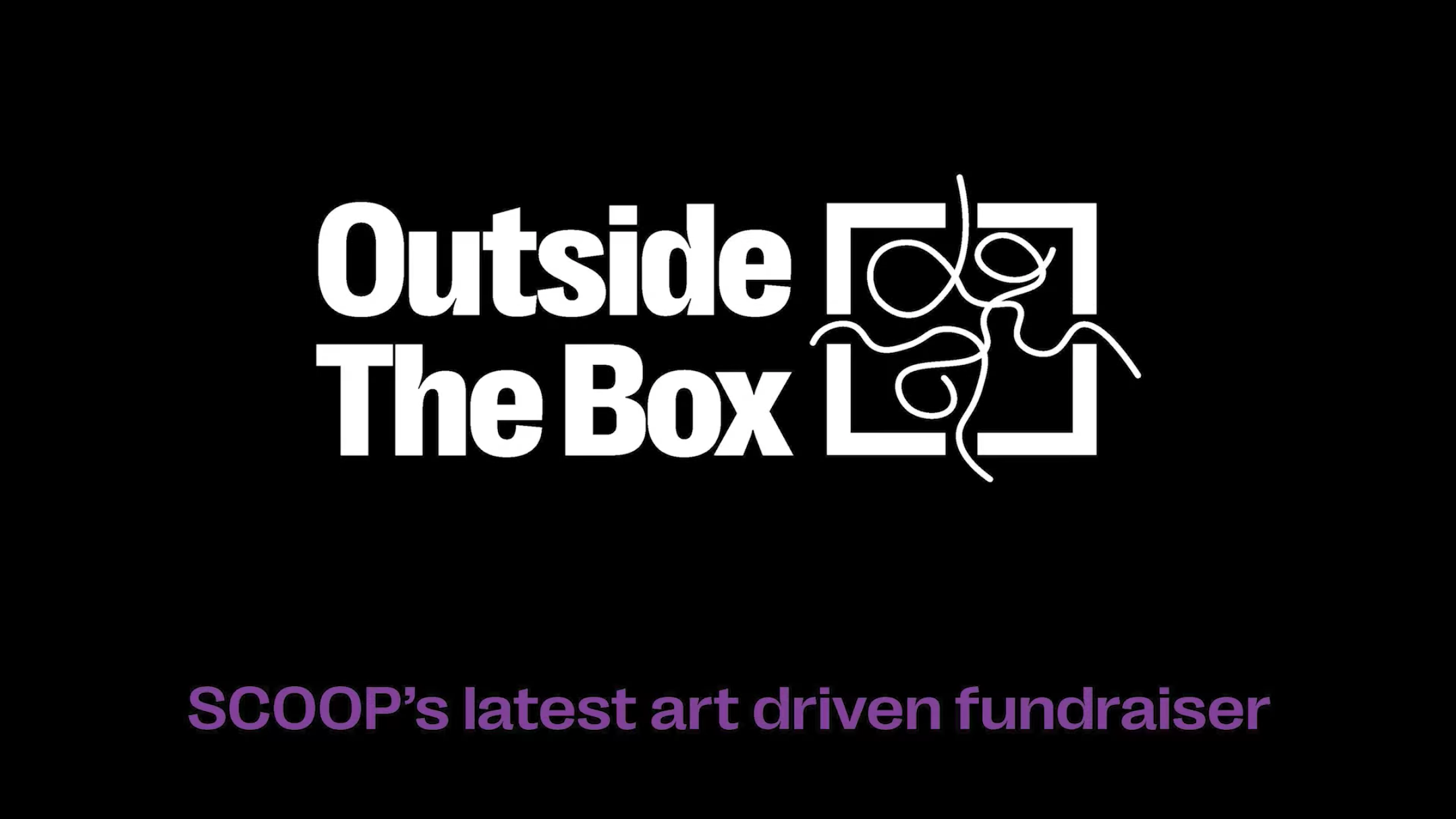
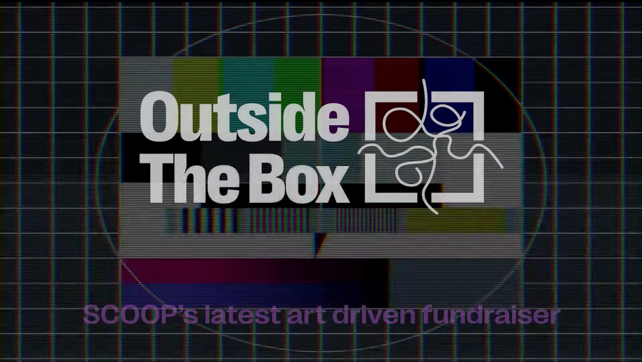
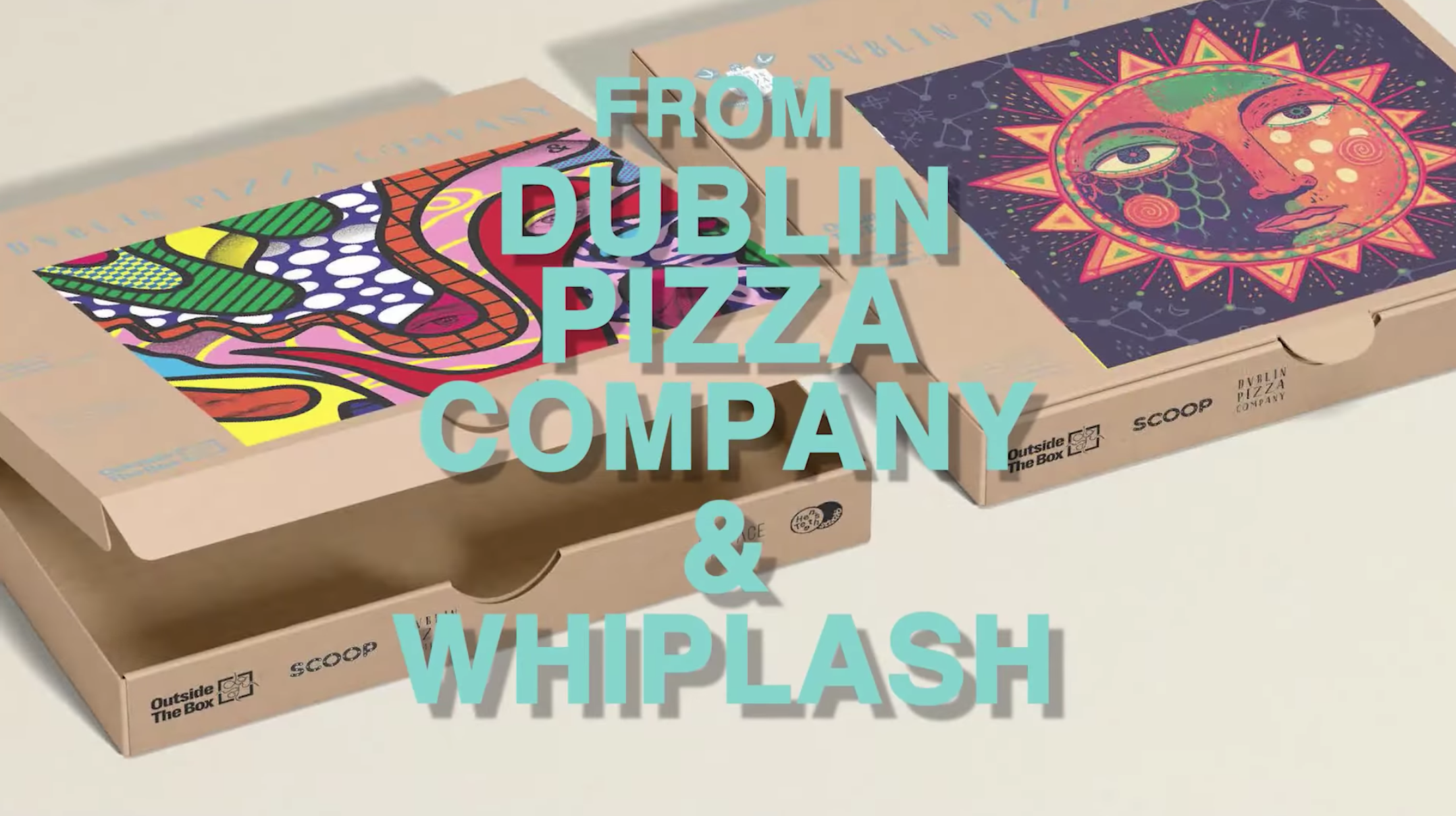
I was tasked with creating a logo for a new fundraising project by the Scoop Foundation called ‘Outside the Box’. Together with Dublin Pizza Company, Scoop would advertise various artworks by Irish street artists on pizza boxes and then hold an auction for the artworks after each month of promotion.
After many iterations, this logo was chosen and went
live
on social media in a promotional video in October 2022.

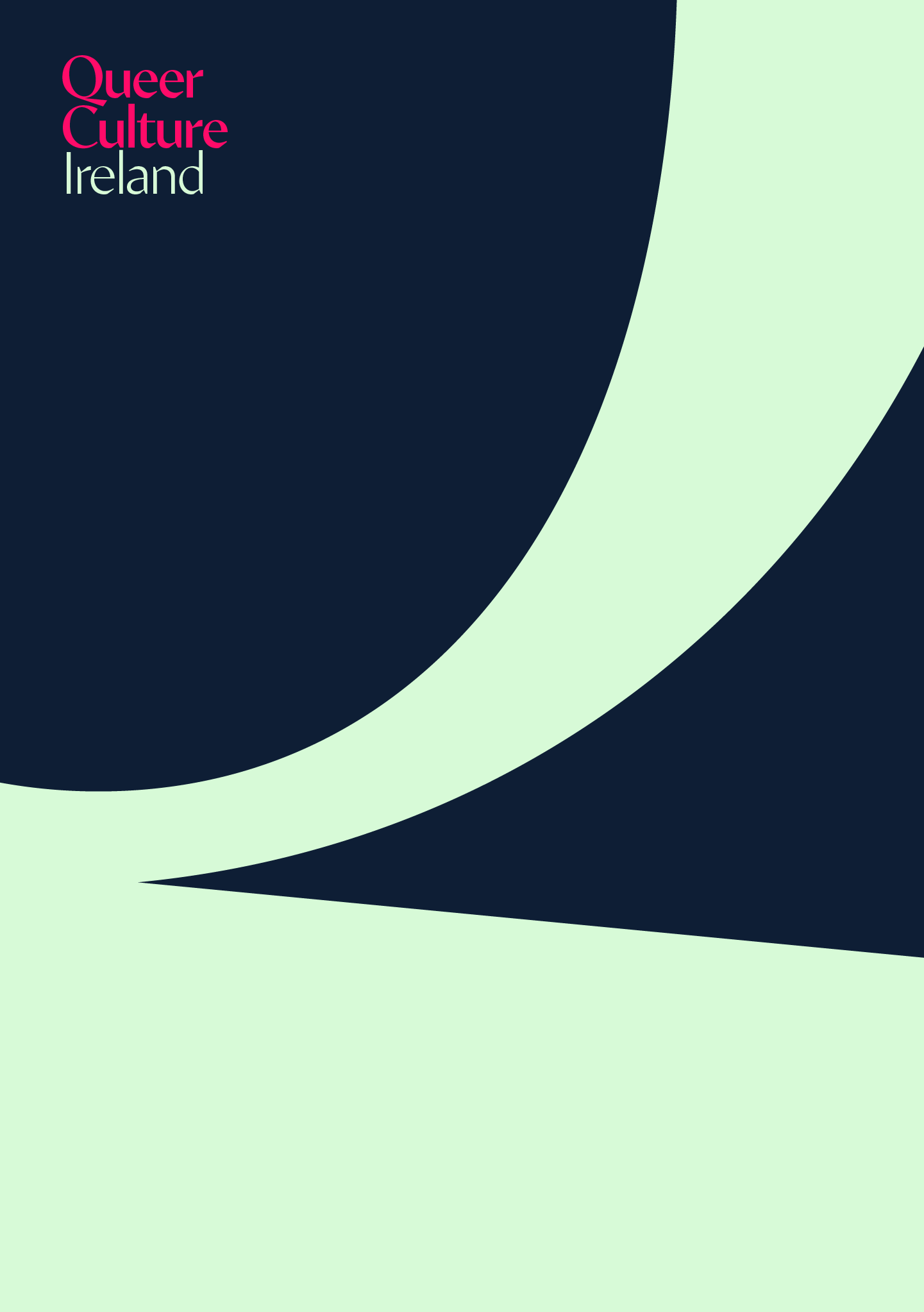
Queer Culture Ireland
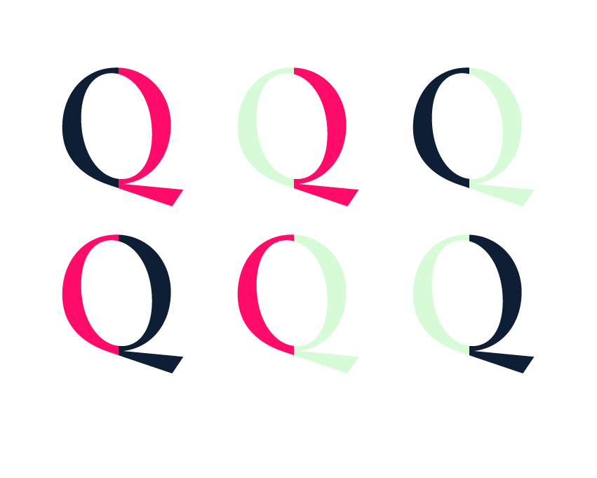
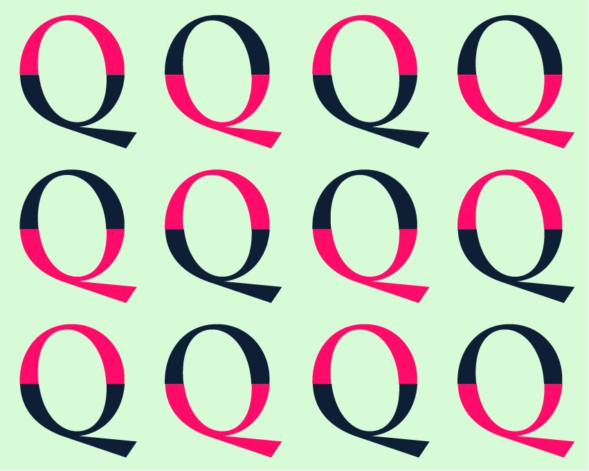
One of our branding clients was Queer Culture Ireland. I came to the project early on when only the typeface and colours had been chosen. It was my job to experiment with the assets and see how they could be applied to letterheads, business cards, compliment cards etc.
Below are two directions I came up with. Unfortunately I didn’t get to see the project through to the end, but I really enjoyed working on these elements.
Direction 1

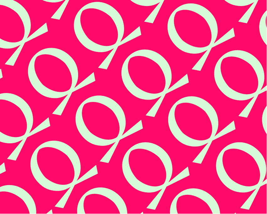
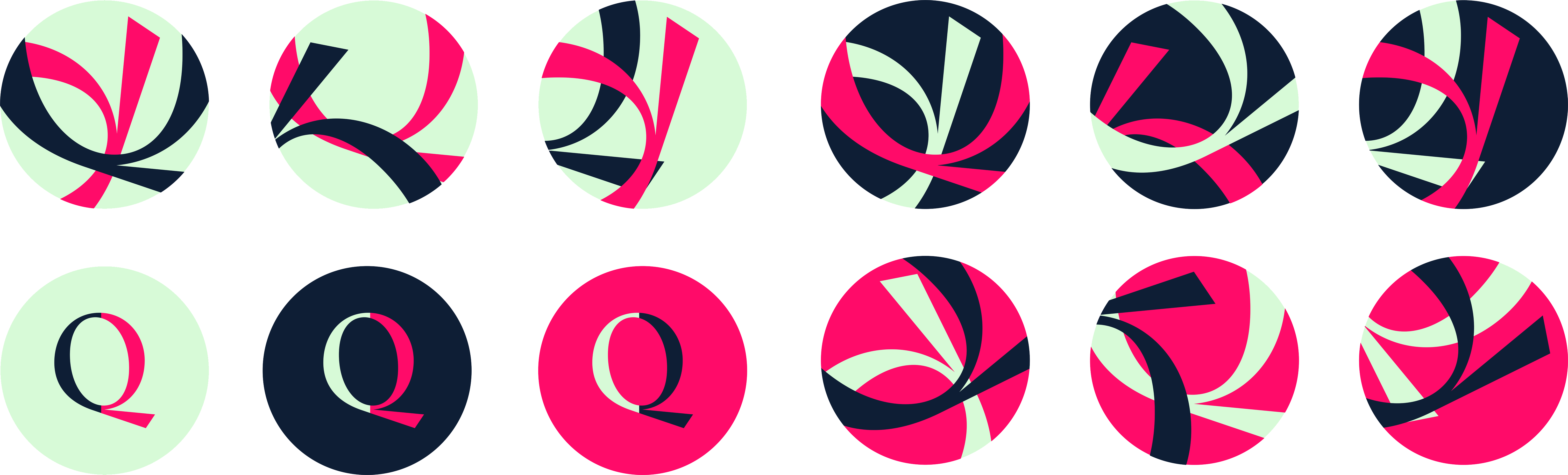
Direction 2


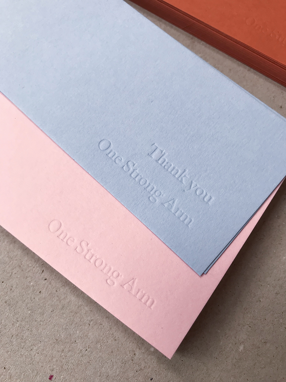
Thank you
I got the chance to do a lot of letterpress printing towards the end
of my internship.
I was asked to make a series of different thank you notes to be packaged with prints when people purchased them.

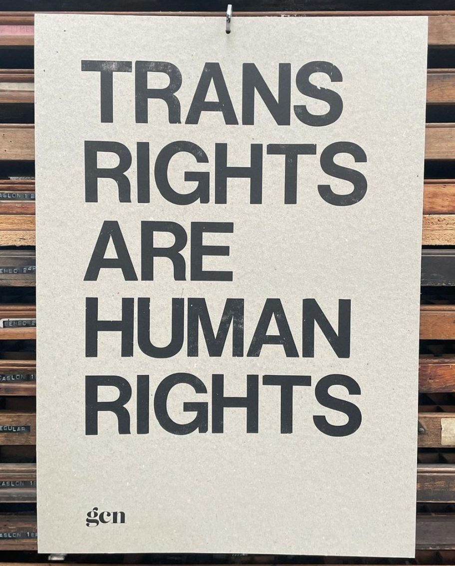
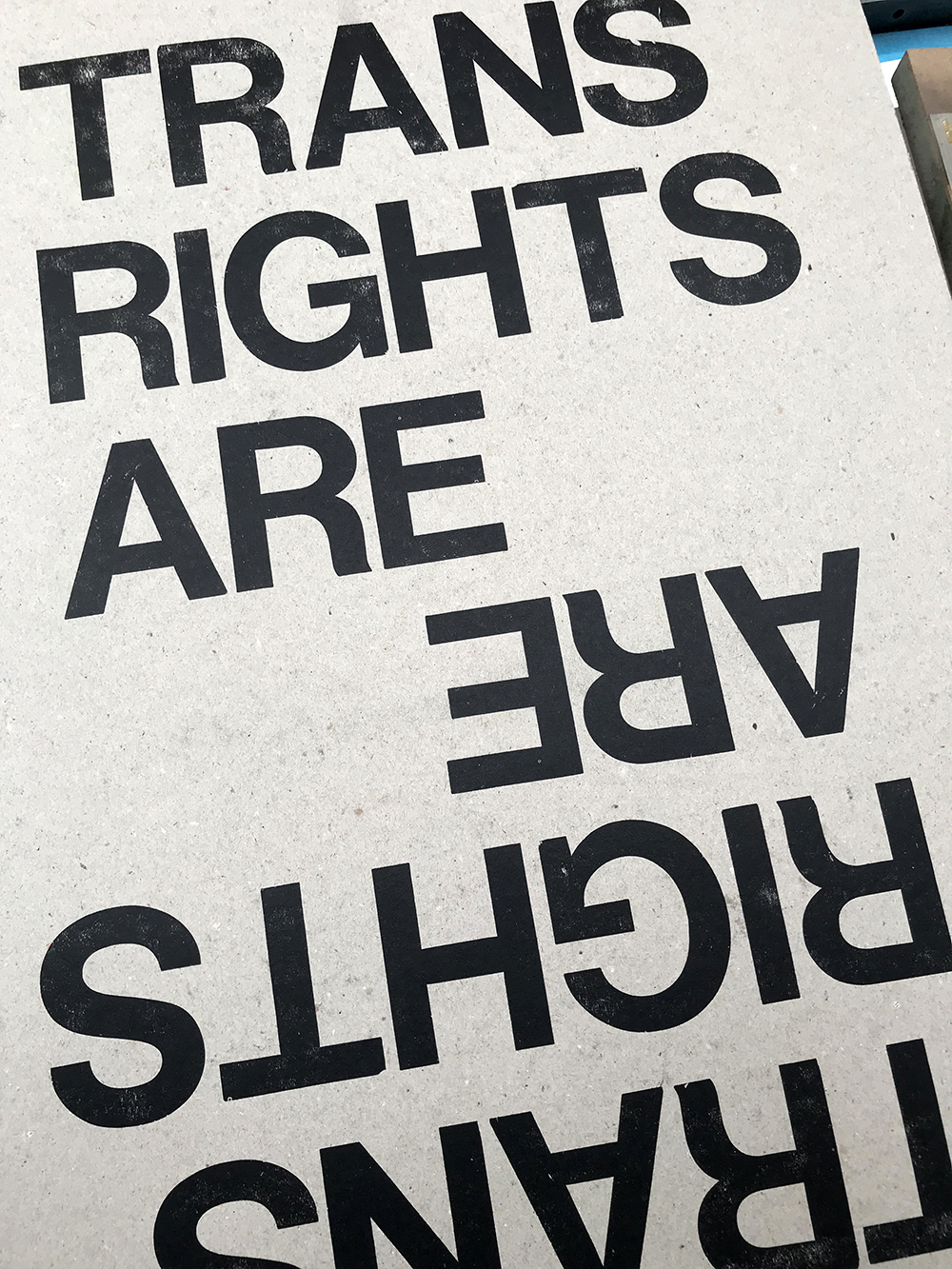
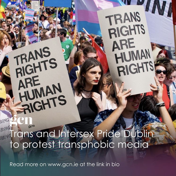
Trans/Intersex Pride
I printed letterpress posters for GCN for the Trans and Intersex Pride Parade in July 2022. I also attended the march and saw people holding the posters there.

Re-prints
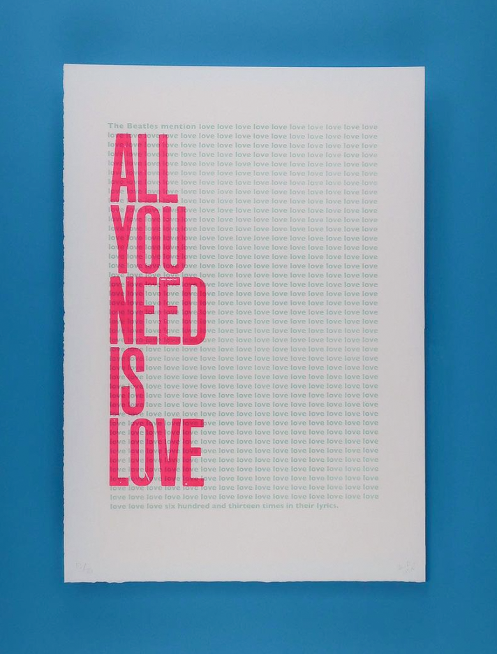
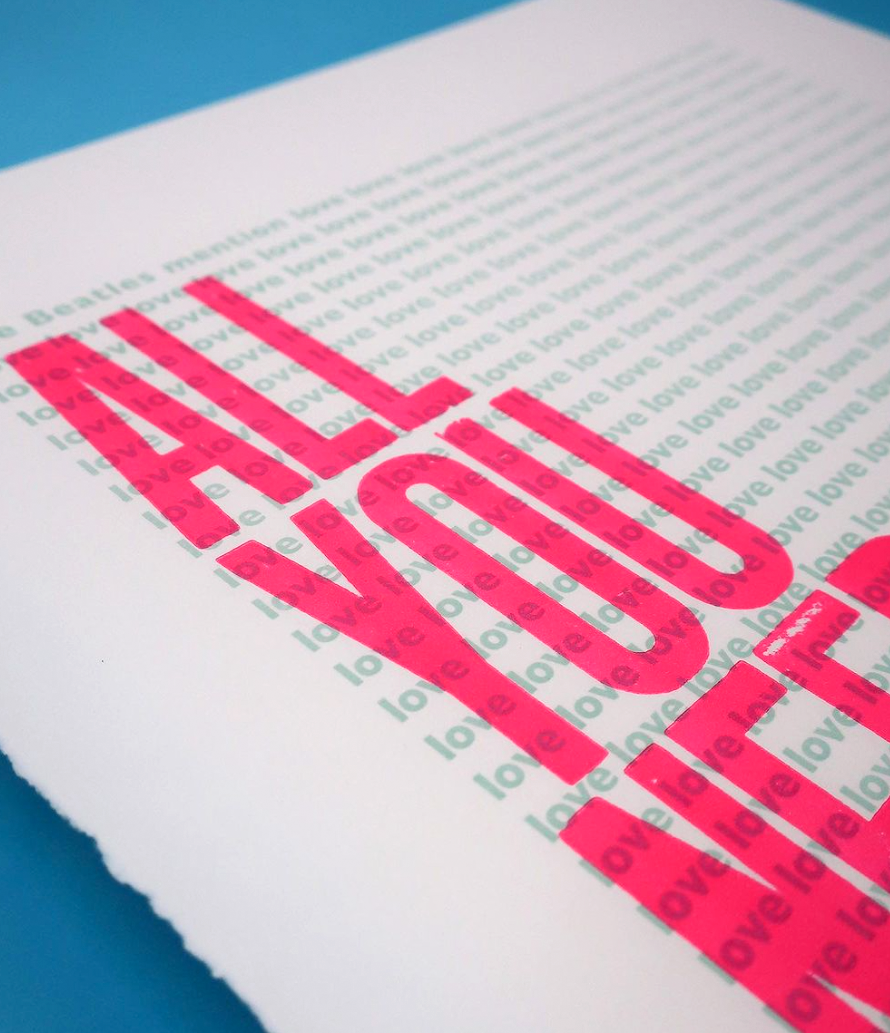
We were re-printing some of the best selling prints on One Strong Arm and I was asked to print the ones shown here. Both very different,
I got to try out different techniques on the printer. ‘All You Need Is Love’ was printed with a special plate made for the background text, and then the larger letters were printed over them.
‘Ever Tried. Ever Failed.’ was a longer process. Not only were there two colours, but I couldn’t print every word in one go because there weren’t enough letters (which really helps to understand how things were done in the past). Each piece of paper was probably put through the press about 10 times!